Nicole Nguyen / BuzzFeed News
No company was closer to being a trash fire in the past year than Samsung. There were the exploding Note7 batteries, then the exploding Note7 battery replacements, then the exploding washing machines, and then, finally, the exploding Samsung battery factory.
Needless to say, the Korean conglomerate, which recently lost its 1 smartphone maker ranking to Apple for the first time in eight quarters, is looking for a win.
Enter the Galaxy S8, the headliner of Samsung’s Redemption Tour.
During my five days of testing, the Galaxy S8 did not catch fire. In fact, the S8 turned out to be exactly what I had expected after my first hands-on: a gorgeous device with great technology inside. Samsung crammed as much screen into this phone as possible. The Galaxy S8 hardware is 83% glass slab and 17% everything else — and it has all the promise of an iPhone/Pixel killer.
The only problem? Like all Samsung phones, it’s pre-loaded with redundant apps and features you don't need. And, though the Galaxy S8 ships with the latest version of Android (7.0 Nougat), eventually the phone will be about five months behind Google’s future operating system updates.
All that aside, the S8 is a *really* good phone, and Samsung devotees with contract renewals coming up are going to want to upgrade ASAP. But those looking to switch will have a lot more to consider.
There’s nothing else on the Android market quite like it.
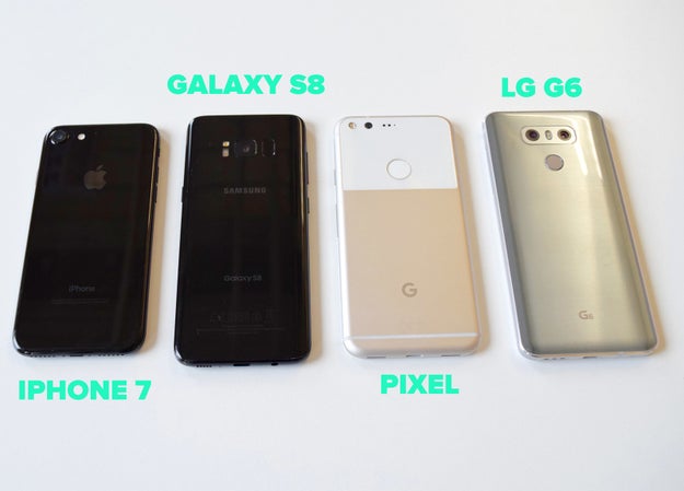
If you’re looking to get a new high-end Android phone right now, here are the three phones I think you should be considering: the Google Pixel, the LG G6, and the Galaxy S8. (For the purposes of this review, I’m not looking at Motorola, Sony, HTC, or Huawei. Don’t @ me.)
Aesthetically, it’s clear which one is the standout: the Galaxy S8. In my initial review, I loved everything about the Pixel, except its uninspired hardware design. LG’s G6 and its small, display-maximizing borders are, in many ways, similar to the Galaxy S8, but it’s a heavy phone that feels bulky.
Nicole Nguyen / BuzzFeed News
The S8, on the other hand, is wrapped in a slick, polished case. This is especially true of “Midnight Black.” It is Posh Spice wearing an all-leather catsuit and Samsung&039;s other color offerings (“Arctic Silver” and the purplish “Orchid Gray”) pale in comparison. The S8 looks modern and clean, and you’d be hard-pressed to find another Android phone with its looks.
The mind-bogglingly good edge-to-edge wraparound display is crisp and saturated, which we&039;ve come to expect from Samsung. The blacks are extra dark and text appears sharp, pixel-less. The display bleeds into the surrounding hardware, and it’s hard to tell where the screen ends and the phone begins.
The only “bezel” is a centimeter-ish border at the top and bottom. There are no physical buttons on the front of the phone, just a pressure-sensitive, virtual home button area. Every other leading Android phone maker has already removed the home button, and Samsung finally followed suit. To maximize the immersive screen experience, the home button is sometimes invisible (like when you’re watching a video full-screen or playing a game) and you can simply press down on the bottom of the screen to return to the main page.
These screens are huge. There are two models: the S8 with a 5.8-inch display and an S8+ with a 6.2-inch display; both are at 2,960×#1,440 resolution. The viewing area has been increased by 36% from the previous versions, the S7 and S7 Edge.
But it doesn’t feel like you’re toting around a mini tablet. The nearly half a million extra pixels were added to the S8’s height, and its edges are curved on all four sides, so the phone is surprisingly grabbable.
The curved edges do, however, make texting with two hands in portrait feel a little cramped. When turned on its side, the phone is too wide for my hands to reach the keys in the middle. Perhaps big-handed users will have better luck.
It’s a very tall phone (nearly 6 inches for the S8 and slightly over 6 inches for the S8+), so enabling the phone’s “one-handed mode” has proven very useful for me. You can swipe your thumb diagonally from either bottom corner to use a mini, more manageable version of the software. Although, my frequent use of this feature reveals that perhaps I don’t need a big screen at all?!?&033;
Nicole Nguyen / BuzzFeed News
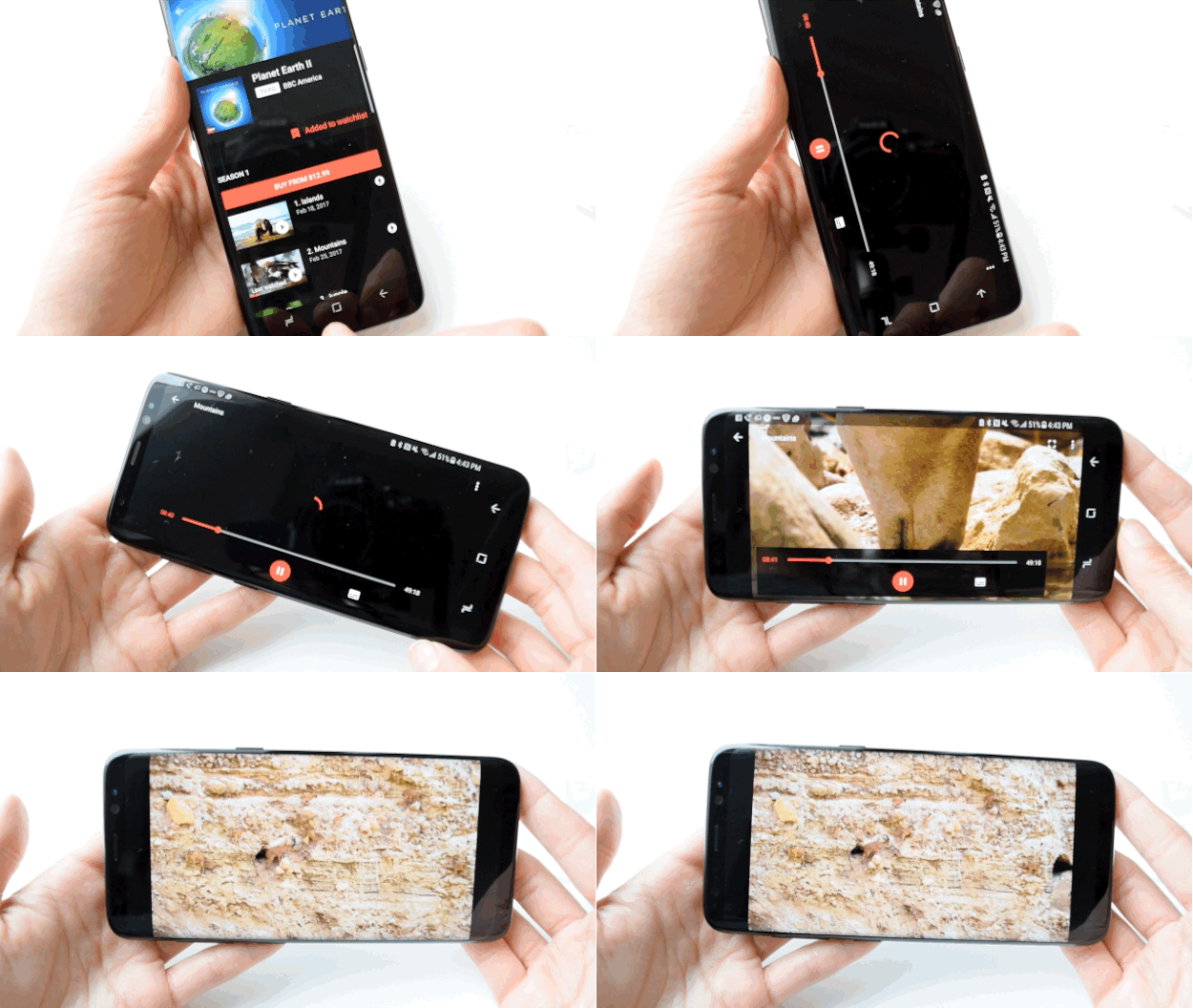
Apparently the S8 is “mobile HDR premium certified,” which means that when you watch shows or movies, you see the same colors and contrasts “that filmmakers intended,” according to Samsung. So I did what any other reviewer would do “for journalism”: I bought the Planet Earth II “Mountains” episode and poured myself a glass (or three) of wine (spoiler alert: ibex goats are badass AF). The display is very bright and vibrant — good for getting into Planet Earth, but ultimately worrisome because I fear it will eventually burn my eyeballs to a crisp.
The S8 is 83% screen, so it’s only fitting that this review is also almost 83% about the screen. Here comes the other 17%.
I tried my hardest to trick the S8’s face recognition unlock, but to no avail.
Reports that Samsung’s face recognition technology had been defeated with a photo surfaced last month. I tried to replicate this with a printed-out photo, with a photo onscreen, and with a Photobooth video of me staring at the camera and blinking. The phone was unfazed. I will never be a hacker.
Trickery aside, face recognition is more a matter of convenience than security. It makes up for the awkwardly placed fingerprint sensor and I found myself relying on it quite a bit.
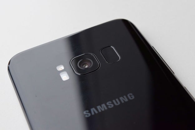
The fingerprint sensor has moved to the back, much to my chagrin.
Nicole Nguyen / BuzzFeed News
The fingerprint unlock feature has traditionally been programmed into the device’s home button. Seeing as the S8 ditched the button, it’s now on the back of the phone. The S8’s fingerprint sensor and the camera feel basically the same, which means I kept smudging the camera lens and unlocking the phone at the same time. It’s really too bad because, minus the finger smears, the camera is quite good.
Speaking of the camera, it’s the same as the Note7’s and the Galaxy S7 before it.
The phone’s rear camera hasn’t changed. It’s a 12MP lens with f/1.7 aperture, and it notably does not have the “dual lens” setup (a camera with two lenses) that Apple, LG, and Huawei introduced with their most recent flagship devices. But I didn’t really miss it in the S8.
Samsung likes to tout its primary camera’s low-light capabilities and fast auto-focus, even with motion. At full zoom, it handled capturing this surfer fairly well (in the rain&033;):
And this darting newt:

Nicole Nguyen / BuzzFeed News
And this amazing lemon poppyseed bundt cake my friend Lauren made:

Nicole Nguyen / BuzzFeed News
The real news is the S8’s upgraded front-facing camera, which is now 8MP (up from 7MP in the Note7) with the same f/1.7 aperture. Here’s an unedited Samsung selfie:

Nicole Nguyen / BuzzFeed News
And an iPhone’s (the iPhone’s camera is just 7 megapixels):

Nicole Nguyen / BuzzFeed News
The main difference is that, because it’s a higher-resolution image, you can zoom in more on the Samsung selfie. I&039;ve showed these photos to multiple people — and votes are split right down the middle. The look of a photo is ultimately a matter of preference and I will let you, Internet, be the final judge.
There are also new Snapchat-style stickers built-in, which…sigh.
Nicole Nguyen / BuzzFeed News
Bixby, the S8’s artificially intelligent assistant, is kind of…dumb right now.
Samsung created its own version of Alexa, Siri, and Google Assistant. It’s called Bixby, and it’s really an umbrella term for three different “intelligent” features: computer vision/image recognition software, a voice-enabled assistant, and a namesake app called Bixby that shows you different personalized “cards” that offer information like weather and upcoming flights (essentially this Google app feature).
Bixby Voice
What makes Bixby different from other assistants is that anything you can do on your phone with touch, it can allegedly do it with your voice instead. You can say things like, “Set display brightness to maximum” and more contextual requests like, “Rotate this photo to the left.” Unfortunately, Bixby Voice doesn’t launch until later this spring and I didn’t get to test it out myself.
Bixby Vision
I was, however, able to try Bixby’s vision recognition software, which uses the phone’s camera to “see.” For example, you can hold up a QR code and Bixby can take you directly to the link, or you can scan a business card and Bixby will isolate the text, then automatically add a contact from the camera app. It does those two things perfectly fine, but it’s not exactly groundbreaking tech. There are plenty of apps that can do the same thing.
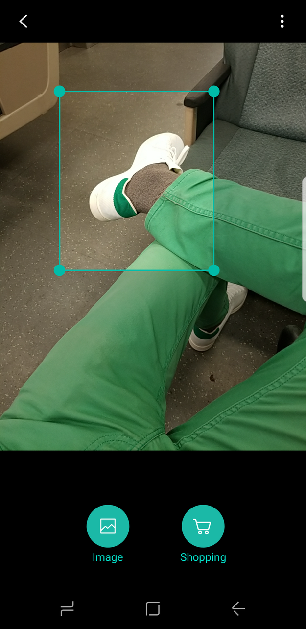
One of the seemingly cooler features is being able to point your camera at a piece of furniture or clothing so Bixby can use use Pinterest-powered computer vision to find out where to buy it. I was excited to try this and hoped it would eliminate “where did you get that” small talk with more stylish ladyfriends.
Nicole Nguyen / BuzzFeed News
But when I tried it out (on my boyfriend’s white Adidas shoes and a pair of amazing culottes), Bixby showed me Amazon results that matched the general shape/generic version of what I was trying to search for — and nothing else. In fact, for the culottes, Google reverse image search fared much better and found a Pinterest pin with the specific brand in the description (they are Oak+Fort, btw). I then tried taking a pic of the pin with the hopes that the Pinterest-powered software would pick it up. Nada.
Bixby Vision results are like asking your mom for a custom American Girl doll that’s designed to look just like you, and getting a Secret Hero Mulan from a KB Toys closeout sale instead.
Bixby App
I didn’t find the Bixby app too helpful. It showed me details for an upcoming flight and the week’s weather, plus trending topics on Facebook, which was cool. There was a random puppy napping GIF from Giphy as well, though I’m not sure if that was personalized content.
Right now, it’s hard to assess whether Bixby is a success, because so much of the technology is still in development. As it stands, Bixby is a gimmick that’s fun for showing off to friends but not smart enough to actually be useful. Plus, Google Assistant, which ALSO comes with the S8, can do just about everything Bixby can do and then some.
The battery didn’t explode.
The 3,000 mAh battery in the S8, the version I tested rigorously, performed well. The phone, as I’ve previously mentioned, is all screen, so it isn’t surprising that the display was my 1 battery suck for three days in a row.
The phone’s battery takes about an hour and 40 minutes to fully charge via USB-C cable, and has lasted me about a day and a half on average. This is with reading articles in an hour-long round-trip commute, watching 30-minute videos, followed by 30 minutes of gameplay, and with the usual slew of Facebook and email notifications enabled. Batteries, of course, decay over time, so I’m not sure how long that’ll last. I’ll update this review if that changes.
It feels fast enough.
The Galaxy S8 is the first device to ship with the newest Qualcomm processor: the Snapdragon 835, which is faster than its predecessor (the Snapdragon 820) but uses less power than other chips. The phone felt zippy during this first week of testing, but, like batteries, its processor will decay over time.
I played Super Mario Run, a casual sidescroller, and CSR Racing 2, a 3D graphics-intensive racer, a LOT during the testing period. They played smoothly and didn’t significantly drain the battery.
The processor is apparently robust enough to power a computer, using the new Samsung Dex portable dock accessory (price TBD) that can be hooked up to a monitor, keyboard, and mouse. The dock essentially turns the phone into an instant, lightweight Chromebook — in the demo I saw, the phone ran two apps simultaneously. I didn’t get to test the Dex out either, but once I do, I’ll update this review.
And now, a rant.
As gorgeous as the hardware is, the S8 is a Samsung phone, and I can’t review this device without noting this disclaimer: Samsung phones are (still) filled with so much crap. Samsung’s OS (called “TouchWiz”) looks cleaner than ever before, and it’s getting better. But it remains full of bloatware.
For example, I tested a T-Mobile version of the device. Right off the bat, there are four T-Mobile apps on the homescreen that I’ll likely never use, including “T-Mobile TV.” Then there are Samsung apps, like the mobile browser aptly named “Internet,”plus the Google versions of those exact same apps, like Chrome, already installed. There’s Android Pay, and Samsung Pay. There’s Gallery, and Google Photos.
Then there are Galaxy apps (which are apps made by Samsung or special “themes” to customize how your phone looks), in addition to apps you choose to download from the Google Play Store. There’s a dedicated side button for Bixby Voice, and OK Google can be activated by longpressing the home button. It’s a hot mess.
All of this is pre-loaded on the phone — and I know it can be removed from the home screen or uninstalled, but…ugh&033;
Samsung deeply alters the Android experience, down to the way windows scroll in the app switcher. You’ll see on the Pixel that there’s a smooth, continuous scroll and on the S8, a clunkier unit scroll.
Quelle: <a href="The Galaxy S8 Is A Gorgeous Phone. Too Bad It’s Made By Samsung“>BuzzFeed
Published by