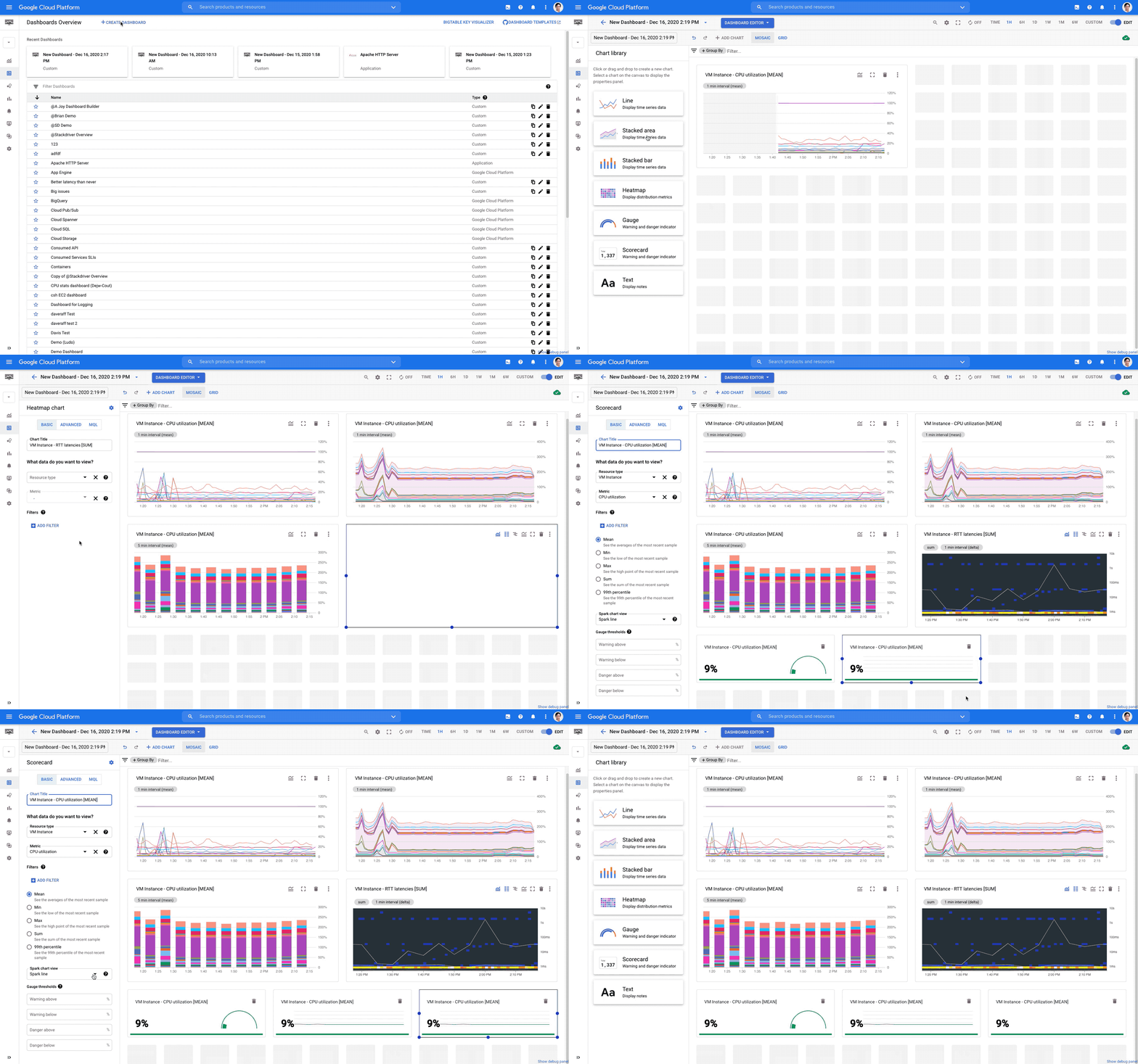
Having good observability is vital to the health of your cloud infrastructure and applications, and a key element to using that information effectively is being able to create dashboards with relevant metrics.Today we are announcing a new dashboard creation experience from Cloud Monitoring that allows you to generate a greater variety of visualization types, introduces better flexibility for dashboard layouts, and makes data manipulation easier so you can create dashboards that better fit your needs.So, what’s new with the dashboard?More flexibilityWith this update Cloud Monitoring now supports a mosaic layout with drag-n-drop charts that are easier to resize. Charts can be arranged in whatever position is most convenient for you with just a few clicks of your mouse. We also increased the total number of charts from 25 to 40 per dashboard.New component typesThree new component types are now available in the dashboard creation UI: gauge, scorecard and text. These new types join the existing four: line, stacked area, stacked bar, and heatmap.On a gauge chart you can display a single value for time-series data to assess the performance of that value. For example, the chart below displays how much of the CPU is being utilized by all VMs averaged across the entire project. You can use other aggregation types like Min and Max. You can also specify the warning or danger threshold ranges for the chart to change colors.The scorecard chart also allows you to display a single value. However, unlike a gauge chart, it tracks the value over time:In a text component, you can use markdown to link to another dashboard, a playbook, an incident page or a specific instance ID so you can get yourself around faster. For example, to add a link to the Google Cloud Console, the markdown is [Google Cloud Platform] (https://console.cloud.google.com/) as in the screenshot below. You can also place multiple text charts as line breaks to separate sections on your dashboard.Advanced visualization configurationsIn addition to these new features, we are introducing an advanced configuration capability and adding Monitoring Query Language (MQL) support for almost all visualization types. Cloud Monitoring’s basic mode has settings that should capture most of your needs so you can visualize your time series without requiring any complex configuration. If your data visualization requires more than a basic configuration, you can use advanced mode, which supports custom aggregations and multiple time series on one chart. Using MQL, you can perform calculations between metrics to generate a ratio of time-series or apply other advanced queries to reveal deeper insights from your data.Backwards compatibilityWith all these updates, you may be wondering if you’ll still be able to view and edit all your previous dashboards with the new editor? The answer is yes. Additionally, the new editor allows you to perform much more advanced data processing, for example preprocessing metrics of the distribution value type (a bucket of numeric values) into a single numeric value within one simple click.These exciting new dashboard creation features are available by default today. Just go to the Google Cloud Console, navigate to the monitoring dashboard section and try it out! We can’t wait to hear from you about your experience and feedback!Related ArticleHigh-resolution user-defined metrics in Cloud MonitoringNow you can write custom and Prometheus metrics for Cloud Monitoring every 10 secondsRead Article
Quelle: Google Cloud Platform


Published by