The New MacBook Pro: A Perfectly Fine Laptop For No One In Particular
Apple’s new top-of-the-line laptop is impressively lightweight, but it may not be the home run longtime MacBook Pro users were hoping for.

BuzzFeed News; Apple
The all-new MacBook Pro is the laptop that loyal MacBook Pro users have been waiting for since 2012. But it might not be the one they were expecting.
Apple’s new laptop, which starts shipping in mid-December, is lighter and thinner than its predecessor. There’s a model with a tiny touchscreen called the Touch Bar, and a 13-inch model without, aimed at replacing the MacBook Air.
When the fourth-generation Pro offering was announced in October, the first major redesign for the premium laptop line in four years, the Maclash was very strong.
Gone is the strip of physical function keys, MagSafe charger, SD card reader, HDMI, mini DisplayPort, and USB ports. It's all been replaced with multiple USB-C ports and a headphone jack (OMG!&033;), which is the only legacy input that remains.
Apple has removed the ports that some thought made the MacBook deserving of its Pro moniker.
“I’m out of apologia juice for defending Apple,” tweeted David Heinemeier Hansson, creator of the Ruby on Rails web development framework. “Those complaining about Apple’s current Mac lineup are not haters, they’re lovers. They’ve spent 10+ years and 5+ figures on Macs,” tweeted @lapcatsoftware, a self-described longtime Mac developer.
Meanwhile, some Mac users complained that the the new MacBook Pro appears to be underpowered for its price. The machine runs on last year’s Intel Skylake chip, and not the more recent, slightly more powerful Kaby Lake (which the chipmaker claims is about 12% faster in raw performance).
So, were the complaints warranted?
In my week and a half-ish with the new MacBook Pros, I found the laptops to be impressively fast and lightweight, but perhaps not quite the home run for which diehard MacBook Pro users had hoped. I tried both Touch Bar and non-Touch Bar models. The 13-inch non-Touch Bar laptop is clearly a win for those looking to upgrade aging Airs, as it’s lighter, thinner, and more powerful than the Air line.
But it’s not clear who exactly the MacBook Pro with Touch Bar is for — other than early adopters who won’t mind toting around a handful of dongles in order to push USB-C, the port of the future, forward.
The MacBook Pro’s marquee feature is the Touch Bar, a new Retina, multi-touch screen that displays a set of additional controls that change according to what apps you have open.

The Touch Bar is so slick and smooth, it feels frictionless. It’s a virtualization of the keys you’d typically find at the top of the keyboard, with some more bells and whistles.
The whole gang’s still there: the ESC key, music controls, volume control, the Launchpad shortcut that I’ve literally NEVER seen anyone use, a dedicated Siri button, etc. Touch Bar can be customized in a number of ways with actions like Screenshot and Show Desktop (my favorite *hide everything* trick for when people creep up from behind).
As one might expect at this early stage, the only apps with Touch Bar support right now are Apple-designed ones like Photos and Mail, and some applications make better use of Touch Bar than others.
My favorite is viewing PDFs in Preview, which you can quickly highlight with a single tap. The bar also allows you to stay in full screen longer in the Photos app by placing a menu of touch-based editing tools right at your fingertips. In Final Cut Pro, you can precisely trim clips with your finger, which feels more ergonomic than using your trackpad. In QuickTime, being able to scrub videos backwards and forwards with precision is pretty sweet, too.
Finger input feels easier, faster, and more precise than clicking and dragging on a trackpad. Another neat feature is that adjusting volume and brightness only requires a single swipe: Instead of multiple key taps, you can press and hold the volume icon and then move your finger back in forth to adjust.
Nicole Nguyen / BuzzFeed News
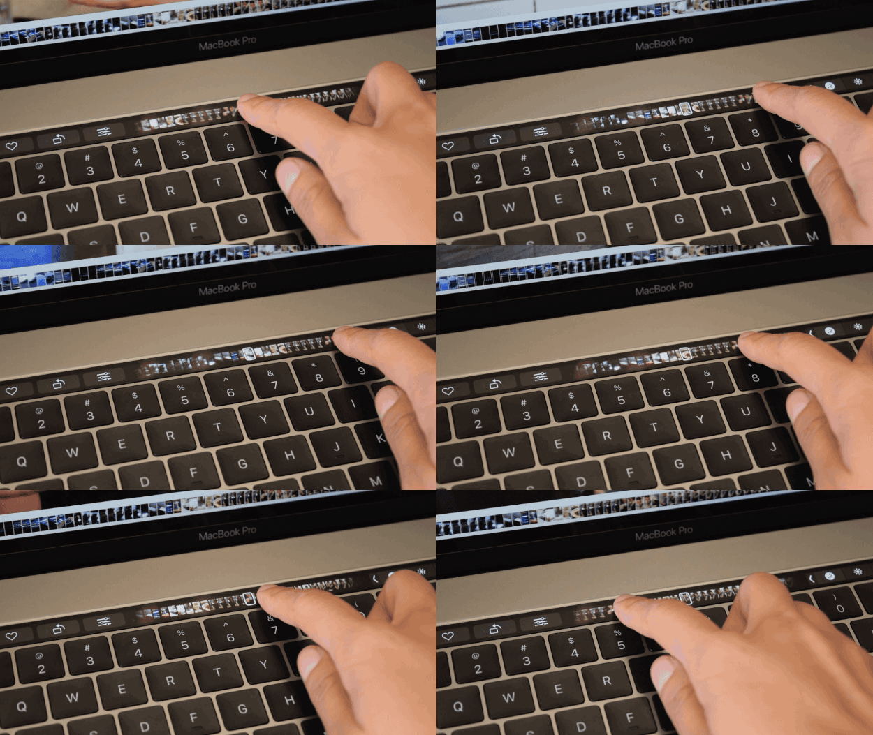
Other Touch Bar functions, like tab preview in Safari, seem more forced.

As you can see here, Touch Bar&039;s Safari tab previews are insanely small and difficult to read; It’s hard to imagine anyone would select a tab using the Touch Bar instead of the control + tab shortcut. That said, it is fun to swipe through all 123,801,293 of your open tabs.
Another is the emoji bar in Messages, which, at first, seemed great for quickly selecting frequently used emoji. However, to find something specific, you have to scroll and scroll and scroll, which seems silly when there’s already a great keyboard MacOS shortcut for it (control + command + spacebar = emoji heaven).
Nicole Nguyen / BuzzFeed News
Quelle: <a href="The New MacBook Pro: A Perfectly Fine Laptop For No One In Particular“>BuzzFeed


