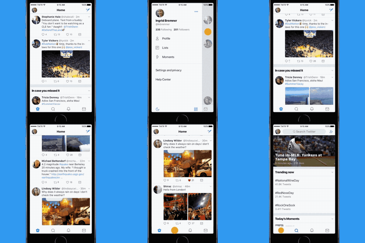
You might see something different about the Twitter app this morning.
Maybe it's gotten a new haircut? Banned some trolls?

Giphy
The “Me” button is gone from the Twitter iOS app. There's now a navigation menu on the left side of the app.

You'll be able to access your profile, additional accounts, settings, privacy, Twitter Moments, and Lists from the menu.
Twitter said in a blog post that the menu is meant to declutter the browsing experience on its iPhone app. The company had already introduced the menu to Twitter for Android last year, according to its blog post.

Like and retweet counts will now update live in the Twitter app in both iOS and Android.
But not on the low-bandwidth version Twitter Lite or on the desktop site. In the past, you'd see updates to the count if you refreshed the page.
And links on Twitter will open in Safari on the iPhone.
Previously, the Twitter app opened links in its own browser, which meant you would have to enter your usernames and passwords for any paywalled site (ahem, Wall Street Journal) that you visited via a Twitter link. Now, if you're already logged into a site on Safari, you won't have reenter that information.
The reply button will look like a speech bubble rather than an arrow, and Twitter is tweaking its typeface. Profile pics will be round instead of square.
Twitter said in a statement that it changed the arrow symbol to a speech bubble in hopes of helping new users, especially first-timers, better understand the social network.
The company wrote that it changed its fonts to be more consistent, and added bolder headlines to “make it easier to focus on what's happening.”

The speech bubble is highlighted in purple, the font in green, and the profile pics in yellow.
Stronger color contrasts will now be available in Twitter's accessibility settings on iOS. You'll also have the option to always open links in Safari Reader view, which looks like this:
You turn Reader View on by clicking the lines to the left of the URL in Safari on iOS. Twitter said it made Reader View and stronger contrasts available to help people with visual impairments use its app.

If you hate the new design, as is often the case with social network updates, you can always go complain about it… On Twitter.
Quelle: <a href="The Twitter App Is Getting A Slight Facelift Today“>BuzzFeed
Published by