From time-saving features to enhancements in your favorite blocks, these block editor improvements will help you build posts and pages on your site, no matter what you publish:
Crop and rotate your images with built-in editing toolsDrag and drop blocks and patterns for more controlDisplay a list of your pages with the new Page List blockMatch your brand palette with an improved Social Icons blockStrategically place your CTAs with a better Buttons blockManage your preferences in a refreshed panel
Let’s take a closer look.
Crop and rotate your images with built-in editing tools
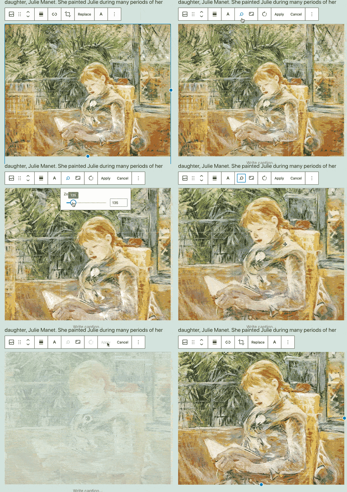
Tired of switching between WordPress.com and an editing tool like Photoshop or Canva to make quick fixes to your images? There’s no need to leave the block editor to crop or rotate your photographs — you can now make changes with a few clicks in the toolbar that appears above the image.
Your original image is always saved in your Media Library, so you can crop and re-crop until you get it just right.
Drag and drop blocks and patterns for more control
Here’s a usability win: you can now drag and drop blocks and block patterns from the Block Inserter on the left directly into your editor canvas on the right. This gives you finer control over where you place new content on a post or page.
Display a list of your pages with the new Page List block
Say hello to the new block on the block: the Page List block! Let’s say you want to show a list of all of your recipe blog’s pages on a single page so readers can see an overview of your culinary content. You can use the new Page List block to automatically compile and display a hierarchical list of all your site’s published pages.
Match your brand palette with an improved Social Icons block
Does your current site background make certain social icons invisible or difficult to see? Do you want to customize the colors? With updates to the Social Icons block, you can now set custom colors for the icons and the icon background by using the color picker or specifying a HEX color code. Match your business or brand palette if you wish!
Strategically place your CTAs with a better Buttons block
A strong and visual call to action, or CTA, encourages interaction on your site, whether you’re a tax consultant seeking new leads with a Contact Me page or an online meditation teacher presenting your membership tiers on a Services page. Using the Buttons block, you can align your CTA buttons on a page, either horizontally (in a row) or vertically (stacked in a column). You’ll see this new vertical option in the block’s settings, so you can switch between layouts with ease.
Manage your block editor preferences in a refreshed panel
We’ve repackaged various options and settings for your block editor into a separate panel, sorted into four sections: General, Appearance, Blocks, and Panels. We hope this more streamlined panel helps you set up your block editor exactly as you want it.
Keep building with the block editor. We’ll keep improving it.
The block editor is continuously growing and improving as a result of your feedback — thank you. We can’t wait to see what you build next with it. In the meantime, we’re working hard behind the scenes, with more updates to come!
Quelle: RedHat Stack

Published by