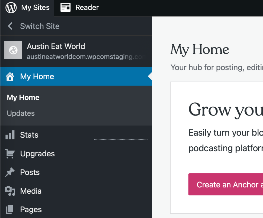
We’re excited to tell you more about WordPress.com’s new navigation experience. The update makes managing your entire site more intuitive and creates consistency across all parts of WordPress.com. This update also allows you all to take advantage of the wider WordPress open source community, creating the same admin menu as WordPress.org that you see referenced in lots of documentation and tutorials.
As we continue to grow, we’ve heard that navigating WordPress.com could be confusing because of different sidebars layouts, menus, etc. We listened to your feedback and ran usability tests on new designs to improve the experience.
Updated Sidebar Menu Design in WordPress.com
This design update combines sidebars and menus that were mismatched and streamlines them into one dashboard that’s consistent for everyone.
For many of you, there will be little to no change in how you use WordPress.com. For those of you who access advanced features, you can easily enable wp-admin as your default view in your Account Settings. We’re surfacing most menu items from third-party plugins and themes by default. You can learn more about interface and account settings here.
While you’re in Account Settings, give your WordPress.com interface a new color scheme. You can now choose a color for your dashboard.
Thanks for the continued feedback to make WordPress.com more intuitive to use for all. And we’re not done yet – we’ll continue to listen and evolve as WordPress.com grows. Happy WordPressing!
Quelle: RedHat Stack

Published by